Make Your LearnDash Course Grid Look EXPENSIVE (and Convert More!)
Today, I’m excited to share a powerful way to improve engagement on your LearnDash course grid by redesigning it for better user experience and conversions. If you’re running a WordPress membership site, this method will help guide your students toward taking action more effectively.
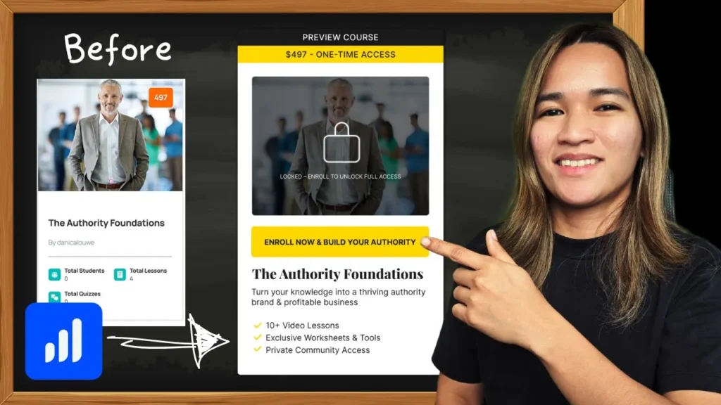
Step 1: Understanding the Default LearnDash Course Grid
By default, the LearnDash course grid provides a basic layout with a featured image, course title, and pricing. While functional, it often lacks the visual hierarchy needed to drive enrollments. When potential students land on a page like this, they may hesitate or get distracted, leading to lower engagement and conversion rates.
Step 2: Optimizing the Course Grid for Conversions
Here’s how we can enhance the course grid design to make it more user-friendly and conversion-focused:
- Enrolled vs. Non-Enrolled Students: Clearly differentiate courses based on the user’s enrollment status. If they are not enrolled, display a “Preview Course” button and a locked icon with a grayed-out image. If they are enrolled, remove the lock icon and grayscale effect.
- Call-to-Action (CTA) Clarity: Ensure the primary action (e.g., “Enroll Now”) is prominent. For enrolled students, replace this with a “Continue Course” button to encourage progress.
- Course Details: Provide concise and relevant information about the course, such as the number of video lessons, availability of worksheets, and access to private communities.
Step 3: Organizing Courses into Phases for Better Navigation
To further streamline the learning experience, consider categorizing courses into structured learning phases. For example:
- Phase 1: Foundation (Courses 1 & 2)
- Phase 2: Monetization (Courses 3 & 4)
- Phase 3: Scale (Courses 5 & 6)
Using LearnDash categories, you can group courses effectively, making navigation smoother and more intuitive for students.
Step 4: Implementing the Design
To create this optimized layout, I used the following tools:
- LocalWP for a WordPress development environment
- LearnDash for course management
- Elementor for custom page designs
- JetEngine for dynamic content customization
By combining these tools, you can customize your course grid layout without requiring advanced coding skills.
Step 5: Testing and Refining the Experience
Once you’ve implemented the new design, test it thoroughly:
- Switch to a test account to check the enrolled vs. non-enrolled experience.
- Ensure the call-to-action buttons function as expected.
- Get feedback from real users to identify any areas for improvement.
Wrapping Up
Optimizing your LearnDash course grid is a simple yet effective way to boost engagement and conversions. By structuring content, improving CTA clarity, and refining the user experience, you can significantly enhance your membership site’s performance.
If you have any questions or need expert help optimizing your membership site, my team and I offer done-for-you services. Visit custommem.io for details.
Let me know your thoughts in the comments below, and I’ll see you in the next one!
Tools & Plugins that used
- Elementor Pro
- JetEngine
- LearnDash

Responses