Build a High-Converting LearnDash Site with Kadence Blocks (Step-by-Step)
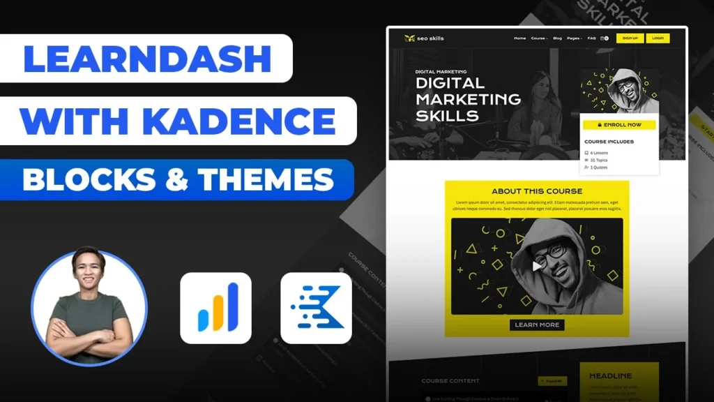
Exploring Kadence Blocks and Themes for LearnDash-Powered WordPress Sites
I’m excited to take you on a deep dive into a fantastic template featured on our website. In this blog post, I’ll walk you through the intricacies of our backend setup, spotlighting the ingenious combination of Kadence Blocks and Themes in conjunction with LearnDash. I’m Danica, and I’ll be your guide as we journey through the fascinating world of WordPress design.
A Familiar Process with an Innovative Twist
As someone deeply passionate about creating stunning WordPress membership sites, I’ve often shared my strategies in previous videos. In this project, I’m following a similar approach to crafting templates for these membership sites. I’m leveraging custom post type meta fields and integrating the power of LearnDash to create an engaging user experience. However, what sets this project apart is the exciting twist – I’ve constructed this template using the dynamic Kadence Blocks alongside the Gutenberg platform.
Peeking Behind the Scenes
Let’s kick off this exploration by delving into the backend setup. I’m here to guide you through the process, offering a clear understanding of each element’s role in the grand scheme of things. Feel free to drop your specific questions in the comments below; I’m committed to providing thorough answers. And for those of you eager to dive in even further, this meticulously crafted template is available for purchase on our website.
Unveiling the Building Blocks
Every element in this template has been thoughtfully designed, each with its own unique purpose and narrative. For a deeper dive into their functionalities, I highly recommend checking out the detailed tutorials I’ve shared previously. One of the standout features is the implementation of JetEngine, which empowers us to create dynamic queries for listing courses and managing content visibility. Now, let’s turn our attention to the heart of it all – the user experience.
Tailoring Experiences to Users
Imagine a user who’s not yet enrolled in the LearnDash course. For them, we’ve crafted a distinctive interface that teems with various buttons and intuitive design elements. As users scroll through the content, they’ll stumble upon comprehensive course materials and helpful sidebar items. Now, envision the perspective of an enrolled user – their view is transformed. They’re greeted with an inviting “Start Course” button, immediate access to all course content, and an insightful progress bar that tracks their journey.
Taking a Look Behind the Scenes
Let’s venture into the backend to uncover the magic driving this dynamic template. Our first stop is the elements section. Similar to the process in Elementor, this is where we shape the course template. Dynamic content takes center stage, fueled by the powerful synergy of Kadence Blocks and JetEngine. Buttons, thoughtfully designed for both enrolled and non-enrolled users, come with dynamic visibility settings. The intricate dance of queries determines precisely when each element should be displayed.
Navigating the Course Landscape
Course-specific details, the very essence of this template, are meticulously managed through the LearnDash additional course content metabox. Here, we fine-tune elements like cover photos, start course URLs, and valuable statistical insights. If a user’s access to a course is restricted, they’ll be presented with tailored content along with a dedicated “No Access” button. Kadence’s interface may differ from that of Elementor’s, but it offers an array of powerful customization options, even if there’s a slight learning curve.
Embracing the Need for Speed
Speed is a pivotal aspect of any design endeavor, and Kadence shines brightly in this realm. With an outstanding GTmetrix score of 99, it effortlessly outpaces Elementor in terms of speed, promising users a seamless and efficient experience. As we look ahead, I’m gearing up to test the compatibility of Gutenberg with BuddyBoss, a heavyweight theme known for its complexity. Keep an eye out for my upcoming videos as I unearth more discoveries.
Crafting Style with Ease
While working with Gutenberg might pose some styling challenges, most of these can be elegantly addressed with a mere line of CSS. The true gem lies in the customization potential of dynamic components from Jet Engine and Kadence Blocks. These tools empower you to sculpt and refine your design, ensuring an intuitive user experience. As you explore our early version template, remember that continuous improvements are in the works, fueled by your valuable feedback and suggestions.
A Glance at the Path Forward
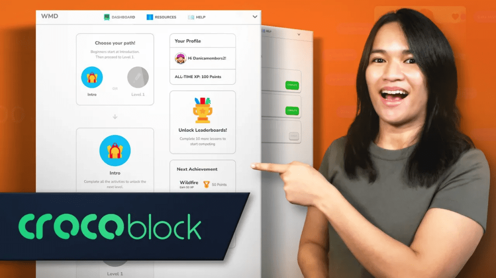
Exciting plans are on the horizon. An Elementor version of a Duolingo-inspired template is in the works, set to diversify our offerings further. Beyond Elementor, I strongly urge you to consider Gutenberg for your template setup. Its unmatched performance potential is well worth the slight learning curve, and the returns it offers are truly impressive.
Wrapping Up
I trust this journey through Kadence Blocks and Themes for LearnDash-powered WordPress sites has been enlightening and inspiring for you. If you’re ready to take the next step in transforming your WordPress membership site into a masterpiece, I encourage you to reach out. Your vision deserves personalized attention, and I’m here to guide you.
Let’s delve deeper into how we can make your membership site stand out and cater to your unique needs. To kickstart this transformative process, I invite you to book a Free Discovery Call with me. During this call, we’ll explore your goals, your challenges, and the exciting possibilities that lie ahead. It’s an opportunity for us to connect, strategize, and determine how WP MembershipDesigns can best support you on your journey.
To schedule your Free Discovery Call, simply head over to this link and select a convenient time. I’m excited to learn more about your project and discuss how we can collaborate to bring your vision to life.
As you continue your design endeavors, know that your questions and suggestions are always welcome. Feel free to drop a comment and keep the conversation going. Until our next adventure, happy designing!
Tools & Plugins that used
- Kadence Blocks & Theme
- JetEngine
- LearnDash

Responses